Recently, it was time to update the color of paint in our living room. We had gone for a lighter green the first time and didn't really like it the minute we finished. "Oh it only needs one more coat" I would say. Not the answer. Really, I didn't take enough time the first time to test my options. Conveniently, Home Depot just came out with small containers of test paint for a reasonable price! As you might recall, I used these for the post on a new color for our wild and wacky office. The office is nearly finished but I painted the living room at the same time and managed to get a focal wall in place.
I found the necessity of taking your time in order to get the results you want! Here it goes:
First step, plan out your attack in the same space your art, photos or shelving will reside. For us, it was still going to be a photography wall but with a different flair. Here's what it looked like before:
I chose to mix and match frames to create a less "put together" or "matchy-matchy" feel. We're cool people, let's think outside the box. I didn't hate it, but because I didn't think it through first I felt there was something missing to the wall. I think I found out it was organization of the original idea. So, next I decided to expand on the current idea and add more to make a bold statement:
Notice that I laid out the frames in the same measured space as the wall. This allows you to visualize how it will look up on the wall - without turning your drywall into swiss cheese. I wasn't crazy about this arrangement and tried it a few different ways. The bottom line, the room just isn't big enough to have a wall with this much going on in one space. It looks artistic but completely chaotic in a smaller room. So, alright Martha Stewart, let's try being "boring" and stick to frames of the same color instead:
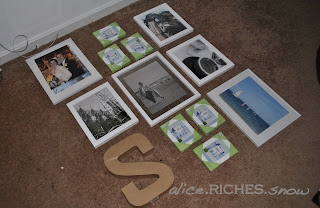
Hey there, that's not so bad. Actually, I loved it. The 'S' added a bit of art without over-doing it. The frames fill up the wall but don't overtake it. Also, each of the photos I plan to put in the frames will be all black and white. The wall itself is a statement in a bright kelly green, therefore making it appropriate to keep similarity in frame color, photo color and theme. It'll tie everything together without scaring/overwhelming your guests as soon as they enter your space.
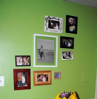
Right now, I'm carefully choosing photos for the frames but we decided to go travel and architecture, clean lines but still interesting and a story of where we've been - and can't wait to go back. [3] of the photos are staying and the rest need to be filled in. Here's what it looks like for right now:
Here, the wall is nicely centered and uniform. However, the photos we chose to put in the frames will spice it up. The wall color is exactly two shades darker than the original and in person, it's just lovely. Very happy and less "in your face" green.
Another thing, don't feel pressured to immediately finish your projects all in one tiny moment, let it stew, make a plan and move on. Not everything is an HGTV show with a finish product in 72 hours or less. But, go ahead and invite some over for dinner in two weeks, you'll be more likely to finish and not place it on the back-burner :) I know, I would also rather sit and watch episodes of Cake Boss on Saturday morning than measure, measure, measure! It takes work to make a home a home, do the work, then catch up on Netflix later.
Oh and on that note, do yourself a favor and when you measure the length and width of your picture frames, plus the location of the hanging apparatus on the back. Jot it down! Write in pencil on the back of the frame and when you decide you need a change, you don't have to do that part all over again! What am I here for except to make your life easier? You can thank me the next time you move or change your next focal wall. It's the little things people.
Coming soon, the extremely improved office space! Still wondering what color we chose? Oh alright, we went yellow! See it soon :)